
Landing Page Examples and How They Differ from a Regular Website
13 min readInWebsite
Short answer
A landing page is one web page created for one action, for example, chatting on WhatsApp to order, and is usually the destination of a click from an ad or a link in an Instagram bio. For example, a laundry page that contains prices per kilo, pickup areas, FAQs, and one repeated WhatsApp button. An ordinary website has several pages and menus to explore.
In the CuciKilat Laundry demo we built, the WhatsApp Chat button appears five times on one page, and all five open a chat to the same number. A landing page indeed works that way: its page only asks for one action, and each part between two buttons answers one reason people haven't clicked it yet. All the landing page examples here are our own demo creations, so the business name, price, address, and testimonials inside are sample fillings.
A landing page is one page for one action; a regular website is for exploring
A landing page is the page where people land after clicking on an ad or a link in your Instagram bio, or scanning a QR code on a brochure. The action it asks for is usually just one, often a WhatsApp chat, sometimes ordering a ticket or registering. A link in bio page containing a series of buttons is often mistaken for a landing page, but its structure is actually the opposite: many options, without a single offer that is thoroughly explained.
A regular website serves different purposes. It contains several pages, such as a profile, services, blog, and contact page, with a menu so visitors can navigate to wherever they want. Someone who types your business name in Google is researching, so they need those options. Someone who clicks on a graduation bouquet ad has come with a specific need, and every link to another page gives them a way out before they can even place an order.
Both can be used together. A website with many services can have one landing page for each promotion, with its own address like namausaha.com/buket-wisuda.
In the CuciKilat demo, each section answers one doubt before the next button
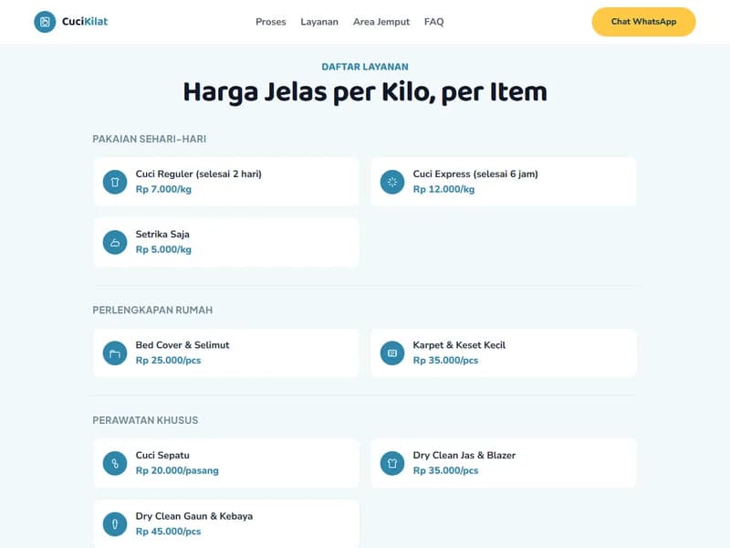
Our CuciKilat demo is set up as a landing page for a by-the-kilo laundry service with pickup and delivery. The order from top to bottom is:
- The first screen: the title Check Price, Schedule Pickup, No Phone Calls, one explanatory sentence, and a WhatsApp button as the only option.
- A strip containing three descriptions: free pickup and delivery within a 5 km radius, can be completed within 6 hours, and open every day from 07.00 to 20.00. We put it before the price list so that people outside the radius immediately know.
- Four work steps, from pickup to delivery. The second step states that the laundry is weighed in front of the customer, so the price is clear from the start.
- A price list by type of laundry: daily clothes per kilo, household items and special care per item. We installed the next button right below it, so people who have found the price don't need to scroll back.
- Pickup area, with the name of the served area and an estimated courier arrival time of 30 to 60 minutes after chatting.
- Testimonials and store gallery, which in the demo are fictional. On the actual page, use customer reviews who allow their names to be used and your own store photos.
- FAQ: how long it takes to complete, what if clothes are damaged or faded, is there a minimum weight or not, and how to pay.
- A closing titled Pickup at Your Home, with an address, business hours, and the last button.
The menu at the top only jumps to sections on the same page: Process, Services, Pickup Area, and FAQ.
The buttons in this demo open an empty chat. Instead, the sentence above the closing button asks visitors to write their address and estimated laundry weight. On the actual landing page, we recommend a pre-filled opening message.
Other service businesses use the same layout, plus one section specific to their business
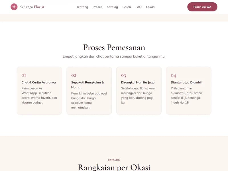
In the Kenanga Florist demo, the special part is the Ordering Process. The first step tells you what chat content is needed by the florist: what event, favorite color, and budget range. The second step promises several flower options and prices to be sent before the order is decided. The visitor knows what happens after clicking the button, and the florist receives the first chat that can be answered directly.
Rapi Barbershop has a section called If You Don't Want to Queue, containing quiet hours and busy hours on business days and weekends. In our opinion, such a table is suitable for barbershops that accept customers without appointments, because people who don't want to wait can choose to come in the morning without asking first.
A landing page for products like hijabs answers size and color before buyers ask
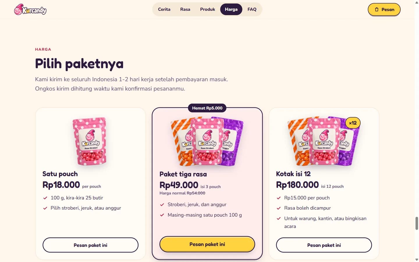
We don't have a hijab store demo yet. The closest is Kurcandy, a fictional candy brand, with price cards titled Choose your pack: one pouch, a three-flavor pack, and a box of 12, each with its contents, price, and a button that opens the order form for that pack. Above the cards is a shipping note: shipped 1 to 2 business days after payment arrives, and shipping costs are calculated when the order is confirmed.
For hijabs, the same layout needs answers to the questions fabric buyers typically ask:
- Size in centimeters. If you use photos of a model, also give her height.
- The fabric name, whether it's see-through, and whether it needs ironing.
- A photo of each color in daylight, a note that colors on screen may differ slightly, and the same color codes used in chat.
- Stock per color. In our view, a color that's sold out is better marked as sold out than removed.
- Rules for exchanging color or size, the time limit, and who pays the shipping.
- A WhatsApp button whose opening message already names the product and color.
Herbal product landing pages are bound by BPOM advertising rules
If your herbal product is registered as a traditional medicine or a health supplement, Peraturan BPOM Nomor 34 Tahun 2022 counts content shown in online media, including social media, as advertising. Advertising content must match the information approved in the marketing authorization, and the authorization holder must get advertising approval from BPOM before it goes live. Exceptions include catalogs that only list the product name, authorization number, company name, and price, as well as ads placed by other parties such as resellers, as long as the claims are still the approved ones.
According to the regulation's annex, the page must include the product name, the authorization holder's name, the authorization number, and the words Baca Aturan Pakai (read the instructions for use). What's prohibited includes:
- Promises to cure, and words such as safe or no side effects.
- An impression that the product works because its ingredients are natural.
- Testimonials of recovery from an individual.
- Discounts, price cuts, or bonuses for sales promotion, except for special packaging approved for a limited time. Pack cards labeled as savings, like those in the Kurcandy demo, can't be used as they are.
Buyers can check the authorization number on the BPOM Cek Produk site, so put the number where it's easy to find. Before an herbal page goes live, match every sentence against your product's marketing authorization and labeling.
A tourism landing page example that turns schedules and quotas into ready-to-send WhatsApp messages
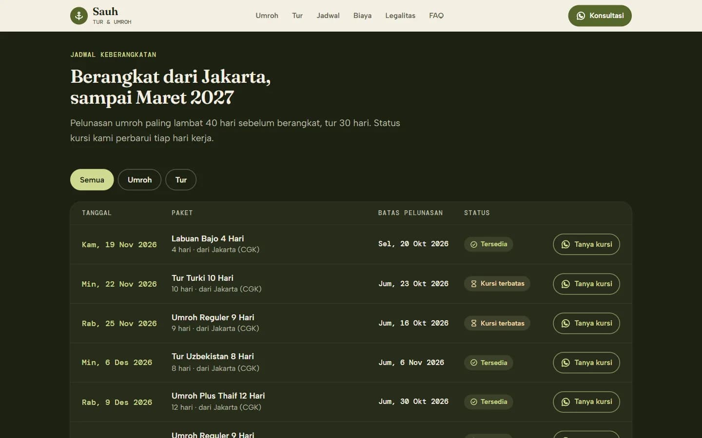
Demo Sauh Tur & Umroh installs a schedule board containing departure dates, package names, final payment deadlines, and seat status. The Ask for Seat button on each line opens WhatsApp with a message that already mentions the package and date: "Halo Sauh, I want to register for Labuan Bajo 4 Hari, departing on Thursday, 19 Nov 2026. Are the seats still available?" The tour package card separates what's included from what's not, down to the ship crew tips and snorkeling equipment rental.
Taman Satwa Nusantara, a demo of a tourist spot that sells entrance tickets, uses the same pattern. All of its ticket buttons open one panel where visitors can choose packages, dates, and the number of adults, children, and infants, then the panel composes a WhatsApp message that's ready to be sent.
For your tourism business, the framework is:
- Schedules or business hours, with quotas if the place is limited.
- Price per person, separated between adults and children if different, along with what's included and not included.
- Gathering points or how to get to the location.
- Payment stages, final payment deadlines, and rules if the schedule is postponed due to weather.
The writing above Sauh's board promises that the seat status is updated every business day. A website without an admin panel, including our Starter and Business packages, does not give you a way to change that status yourself. If the quota changes every day, just display the schedule and ask potential participants to ask about remaining seats via WhatsApp.
Making a landing page starts with the chat message you get most often
The page you create yourself or order through us goes through the same steps:
- Open the chat history for the last month and note the most frequently asked questions. Those that appear almost every day become their own section, while the rest go into the FAQ.
- Determine one action you're asking for, then write the opening message. According to the WhatsApp guide, the format is wa.me/number?text=message: the number is written in international format without a leading zero (62812..., not 0812...), and the message is URL-encoded, for example, spaces become %20.
- Match the title of the first screen with the words in the ad or post that brings people there. A graduation bouquet ad should land on a page with a title that also talks about graduation bouquets.
- Arrange the sections following the order of the CuciKilat demo, then discard the sections that don't answer anyone's questions.
- Gather materials that can't be fabricated: prices, product or your own location photos, address, business hours, and customer reviews from those who have given permission.
- Open the page on your mobile phone via mobile data, then ask someone who doesn't know your business to find the price and button. Fix the section where they stop or ask questions first.
- Share the address with different UTM markers for each location, as in the following section.
UTM tags mark where visitors came from; GA4 does the counting
UTM is a label added to the end of a page address before it is posted in an ad or bio. The three most basic ones, with examples for links in Instagram bio:
- ?utm_source=instagram for visitor origin.
- &utm_medium=bio for the type of link. For paid ads, fill in with paid.
- &utm_campaign=wisuda-oktober for the promotion name.
All three are written together without spaces behind the page address, for example namausaha.com/, with a question mark before the first label and an ampersand before the next labels. Write everything in lowercase, because according to the Google Analytics guide the value is case-sensitive: google and Google are counted as two different sources. Google provides a Campaign URL Builder to combine them. For Instagram and Facebook ads, Meta Ad Manager provides a URL parameter column in the Tracking section, and the Meta guide reminds that the result is still read by the analytics on your website.
In GA4, the label appears in the Acquisition traffic report, in the Source/medium session and Campaign session dimensions. So that WhatsApp button clicks are also counted as results, the click must be recorded in GA4 as an event, then marked as the primary event via the star icon in Admin, Data view, Events.
This site uses both. The WhatsApp button in the middle of this article sends a contact_whatsapp event to GA4 with the article name, and the opening message mentions the article title. The UTM that brought you here is also written in the message of our brief form. GA4 still does not see the chat content and purchase, so record yourself which chat becomes an order, just with the date, source, and result columns.
GA4 and ad tracking code are not on the list of our package contents. If you need them, mention them in the brief, and in our proposal we will write whether they are included or calculated separately. We also do not promise the number of chats or sales from ads.
A free landing page can be made on Canva or Carrd, with a limited address and tracking
The free package of these two services is sufficient for one landing page, according to their official page which we checked on 3 October 2026:
- Canva can publish designs in Website format to a free Canva domain, up to five active websites per free account, with a footer Designed with Canva that cannot be removed. The Link in Bio template is only published at the canva.link address.
- Carrd is indeed made for single-page sites. The free account can publish up to three sites, with the writing Made with Carrd. A custom domain, form, and analytics are only available in the Pro Standard package, starting at 19 US dollars per year.
If you advertise, the most noticeable limit is in the tracking. Canva only allows Google Analytics to be connected in the Pro, Business, Enterprise, and Teams packages, and the website must already be using a custom domain. In Carrd, analytics is also a paid feature. With the free version, UTM links in your ads are not read by anything on the page, and you do not know how many visitors press the WhatsApp button.
To test one quote for several weeks, the free version is sufficient. Once the address is printed on brochures or ads and consumes a monthly budget, in our opinion, a custom domain and tracking are more worth paying for than a better appearance.
A landing page with us falls under the Starter package, Rp 1.500.000
Four out of six demos in this article, namely CuciKilat, Kenanga Florist, Rapi Barbershop, and Sauh, are the size of the Starter package, Rp 1.500.000: one structured page with mobile-first design, WhatsApp button, contact form that goes to email, and basic SEO so that the page can be indexed by Google. Domain .com, hosting, and SSL for the first year are already included, as well as one month of technical support for bug fixes. The work takes around 3 days since we receive the brief and complete materials.
Kurcandy and Taman Satwa Nusantara were built on the basis of the Business package, Rp 5.000.000 with a work duration of 1 to 2 weeks, which also becomes the package for websites with several pages, catalogs, or blogs. Custom animations that follow scrolling or cursors like the ones on these two websites are discussed separately through Enterprise. If you start from Starter and then upgrade the package, what you've already paid will be counted as a discount.
More examples by business type, from workshops to hotels, can be found at 20 examples of small businesses' websites. Details of landing pages as a service are available on the landing page design service page, and the contents of the three packages are side by side on the pricing page.
Next step
Compare what each package includes side by side, or see finished work closest to your kind of business.
More articles
What Is a Company Profile? Contents, and PDF or Website
What is a company profile and what are its contents, differences with brand profile, how to make one, and when to use PDF and when to use a website.
Company Profile Website Examples by Business Type (Try Them)
Examples of company profile websites by business type, from housing developers to contractors and clinics, with worthy sections to imitate and packages.